
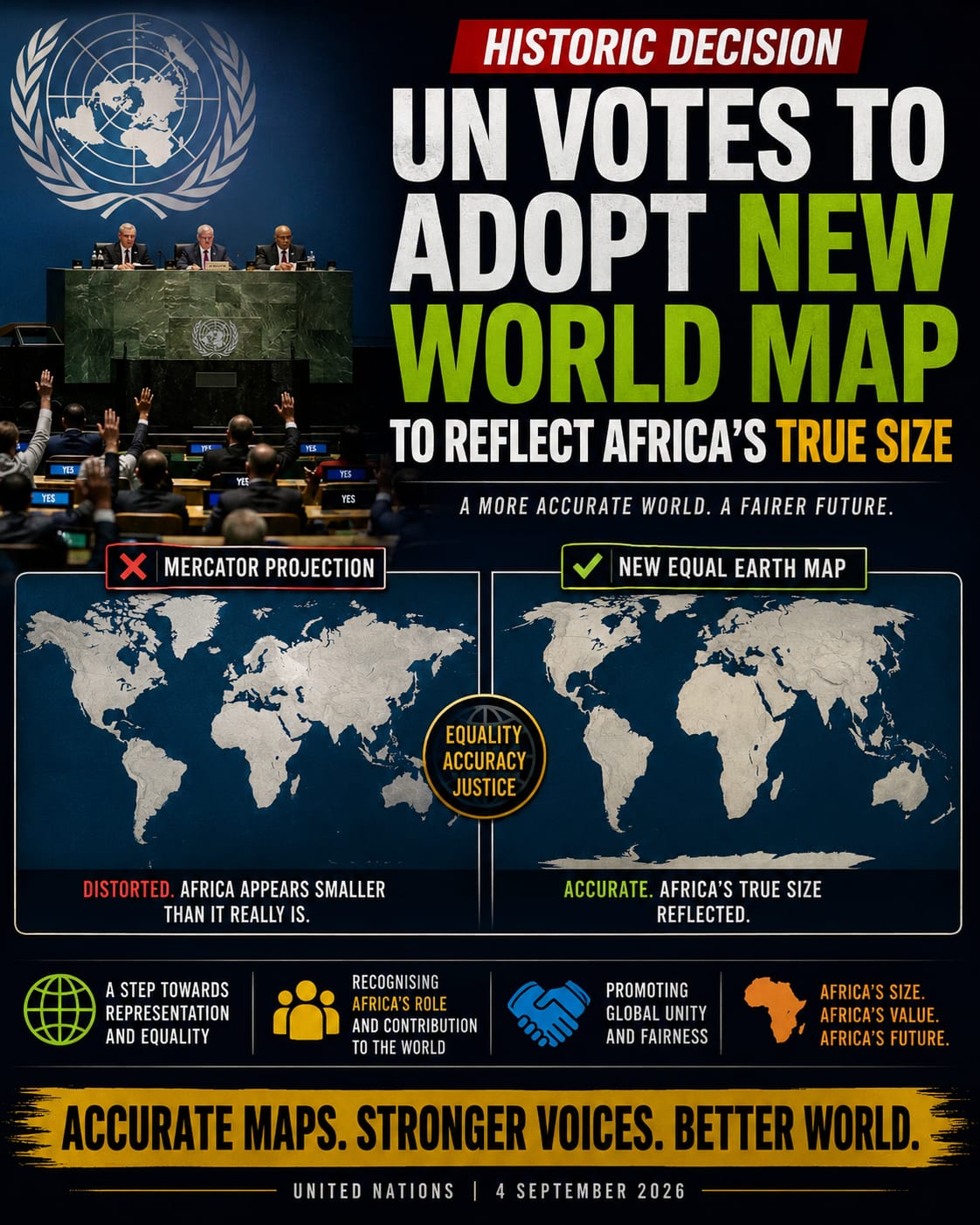
Passed on 4 September 2026, the historic "Correct the Map" resolution was spearheaded by Togo and officially backed by the African Union. It secured 164 votes in favour, with the United States casting the lone opposing vote and six nations abstaining
Toward Geographic Equity: The United Nations and the Movement for a True-Size World Map of Africa
For over four centuries, the global standard for visualizing the world has been dominated by a single cartographic representation: the Mercator projection. Created by Flemish geographer Gerardus Mercator in 1569, this map was originally designed as a navigational tool for sailors. However, its widespread adoption as a general-purpose wall map has resulted in a deeply distorted perception of global geography. Nowhere is this distortion more pronounced—or more politically and culturally significant—than in its depiction of the African continent.
As the international community increasingly prioritizes equity, decolonization, and historical accuracy, discussions have emerged surrounding the United Nations' potential adoption of a standardized, equal-area world map. Such a shift would finally correct the visual minimization of Africa and offer a scientifically accurate representation of the planet.
The Flaws of the Mercator Projection
To understand why a new map is necessary, one must examine the fundamental geometry of the Mercator projection. Because it is impossible to flatten a three-dimensional sphere onto a two-dimensional surface without stretching some areas, mapmakers must choose which properties to preserve: shape, area, distance, or direction.
Mercator chose to preserve navigational angles, making it invaluable for compass-based sea travel. To achieve this on a flat grid, latitude lines are spaced increasingly further apart toward the poles. Consequently, landmasses located far from the equator are drastically enlarged, while those near the equator remain relatively true to size.
This geometric reality creates staggering visual discrepancies:
- Greenland appears roughly the same size as Africa on standard Mercator maps. In reality, Africa is roughly 14 times larger than Greenland.
- Europe appears to be significantly larger than South America, even though South America is nearly double the size of Europe.
- North America and the former Soviet Union occupy a vastly disproportionate amount of visual space compared to their actual landmasses.
The True Scale of Africa
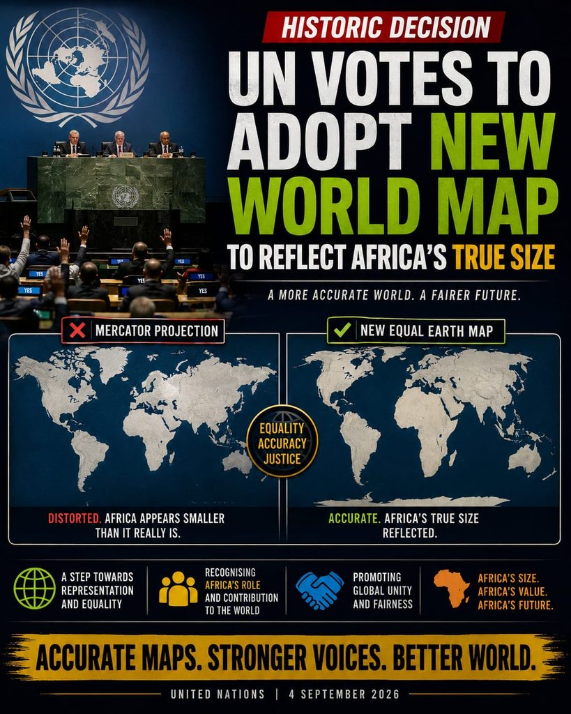
Africa is the world’s second-largest continent by both land area and population, covering approximately 30.3 million square kilometers (11.7 million square miles). It spans both the Northern and Southern Hemispheres and is bisected by the Equator.
To put its true size into perspective, the entire landmass of the United States, China, India, Japan, and much of Europe can comfortably fit within the borders of Africa simultaneously. Yet, on traditional classroom maps, Africa is frequently depicted as being roughly comparable in size to Greenland or Europe.
Cartographers and geographers have long pointed out that this visual shrinkage is not merely an aesthetic issue. Maps are powerful tools that shape human psychology, education, and geopolitical status. Subconsciously, the Mercator map reinforces outdated, colonial-era hierarchies by making the Global North appear monumental and the Global South appear diminutive.
The Gall-Peters Alternative and the Push for Reform
The most prominent alternative to the Mercator projection is the Gall-Peters projection, an equal-area cylindrical map introduced in the 1970s. Unlike Mercator, the Gall-Peters projection maintains the correct relative size of landmasses, allowing viewers to see the true expanse of Africa, South America, and other tropical regions.
While the Gall-Peters map distorts shapes—making continents near the equator look somewhat elongated and stretched—it successfully prioritizes geographic truth over Eurocentric visual bias. Organizations such as UNICEF and various educational systems worldwide have increasingly adopted equal-area maps in recent decades to foster a more accurate worldview among students.
The United Nations, as the preeminent global body representing all nations equitably, faces growing calls to officially transition to an equal-area projection for its official maps, publications, and institutional branding. While the UN currently utilizes a specific azimuthal equidistant projection centered on the North Pole for its official emblem, its standard rectangular maps have historically relied on projections that favor northern latitudes.
Implications of a Cartographic Correction
Adopting a map that accurately reflects the true size of Africa carries profound implications across multiple sectors:
- Education: Millions of students around the world would grow up understanding the genuine scale of the African continent, helping to dismantle lingering stereotypes rooted in colonial cartography.
- Geopolitics and Diplomacy: Visual equity reinforces the diplomatic reality of a multipolar world, emphasizing the demographic and geographic weight of the Global South.
- Environmental and Economic Planning: Climate change adaptation, resource management, and international development initiatives rely on accurate spatial data. Utilizing equal-area representations helps align visual communication with scientific reality.
Key Details of the Historic Shift
- Ditching the Mercator Distortion: For over 450 years, the traditional Mercator projection (created in 1569) has been the global standard. Because it distorts landmasses further away from the equator, it visually shrinks Africa to look the same size as Greenland, even though Africa is actually 14 times larger.
- The New Standard: The resolution actively promotes the use of the Equal Earth map projection. Created in 2018, this projection accurately preserves the proportional size of continents relative to one another.
- The True Scale: In reality, the African continent covers roughly 30 million square kilometres. You can fit the entirety of the United States, China, India, Japan, Mexico, and most of Europe inside Africa's borders with room to spare.
- Impact and Implementation: While the UN vote is non-binding and does not disrupt the Mercator projection's validity for maritime or aerial navigation, it heavily urges schools, tech companies, media outlets, and global institutions to transition to equal-area maps. Togo's government is already planning an implementation summit in early 2027 alongside UNESCO and major platforms like Google Maps.
Why the Vote Matters
Supporters argue this is a major victory for "cognitive justice". Geographers and policymakers point out that map distortions are not just technical errors; they shape historical biases, making equatorial regions appear less significant. Correcting the map represents Africa’s growing demographic, economic, and geopolitical weight on the world stage.
Conclusion
Maps are never neutral; they are human interpretations of the world that encode social, political, and cultural values. For centuries, the dominance of the Mercator projection has understated the vastness and significance of Africa. As the United Nations and the global community move toward a more inclusive and accurate future, adopting a world map that presents Africa in its true proportions is an essential step toward true global equity.